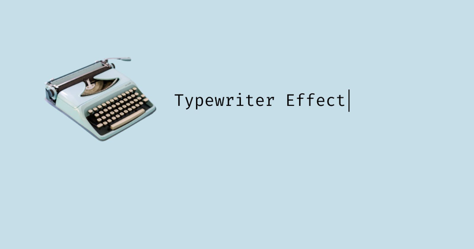
Typewriter effect is an animation that looks like the text is being typed by a typewriter. In this article, let's learn how to do it using CSS without any JavaScript.
This is what we are going to build.

Let's start with the HTML file, we will be using a h1 tag with a class name of 'text' with the text to be animated written inside it.
Our HTML will be looking like this.
<h1 class="text">Hello! I am Gladson.</h1>
Now, let's start with the CSS.
@import url('https://fonts.googleapis.com/css2?family=Fira+Mono&display=swap');

body{
  background:#1d2c36;
  height:100vh;
  font-family: 'Fira Mono', monospace;
  display:flex;
  justify-content:center;
  align-items:center;

}
In this snippet, we have imported a monospace font from google fonts and all the content in the body is placed in the center.
The important thing to note here is that typewriter animation works best with monospace fonts, so be aware of the font you are using.
.text {
  font-size:3rem;
  position:relative;
  width:max-content;
  color:#fff;
}
Here we are setting the styles for the text. It is important to note here that the position should be set to relative this will be required in the upcoming steps. Also, the width should be set to max-content, this is done to set the width of the h1 to the content size else it will be difficult to create the required effect.
Here setting width:max-content won't matter since we have used flex to center the h1 to the center the width will be automatically set to max-content.
So now comes the main part, here is small explanation on how we are going to achieve the typewriter effect.
We will use the ::before pseudo-element to cover the text with a color same as the background color, then we slowly animate the width of the ::before pseudo-element away from the below text using the animation-timing-function as steps in the animation and the steps will be the number of characters in the text including the space.
.text::before,
.text::after{
  content: "";
  position: absolute;
  top: 0;
  right: 0;
  bottom: 0;
  left: 0;
}
So here we have set the ::before and ::after pseudo-elements to the absolute position to cover the text. This is the reason why we set the position of the h1 to relative. ::after pseudo-element will be used to add a blinking cursor to the final effect.
.text::before{
  background:#1d2c36;
  animation:typewriter 5s steps(20) forwards;
}

@keyframes typewriter{
  to{
    left:100%;
  }
}
Here we have defined a keyframes called typewriter that will animate from the initial position (i.e. left:0 ) to left:100%. We have set the animation-duration to 5 seconds and animation-fill-mode to forwards so that it will retain the computed values from the last keyframe encountered (i.e. 100 in this case). The number 20 is the number of characters in the text including spaces.
After this, our output will be something like this.

Note that here I have set the background color to orange so that it will be easier to visualize.
Finally let's add a blinking cursor using the ::after pseudo-element.
.text::after{
  width:0.5rem;
  background:#24a7ff;
  animation:
    typewriter 5s steps(20) forwards,
    blink 750ms infinite;
}

@keyframes blink{
  to{
    background:transparent;
  }
}
Here I have set the width to 0.5rem and a background color. Then there is a blink keyframe to get the blinking cursor animation.
The important thing to note here is that there are 2 animations on the same pseudo-element, this is required so that the blinking cursor moves along with the typewriter animation.
Now our typewriter animation is complete.
I hope you have learned something new after reading this article.
Thank you for reading.
